Retail Sensor Deployment Dashboard
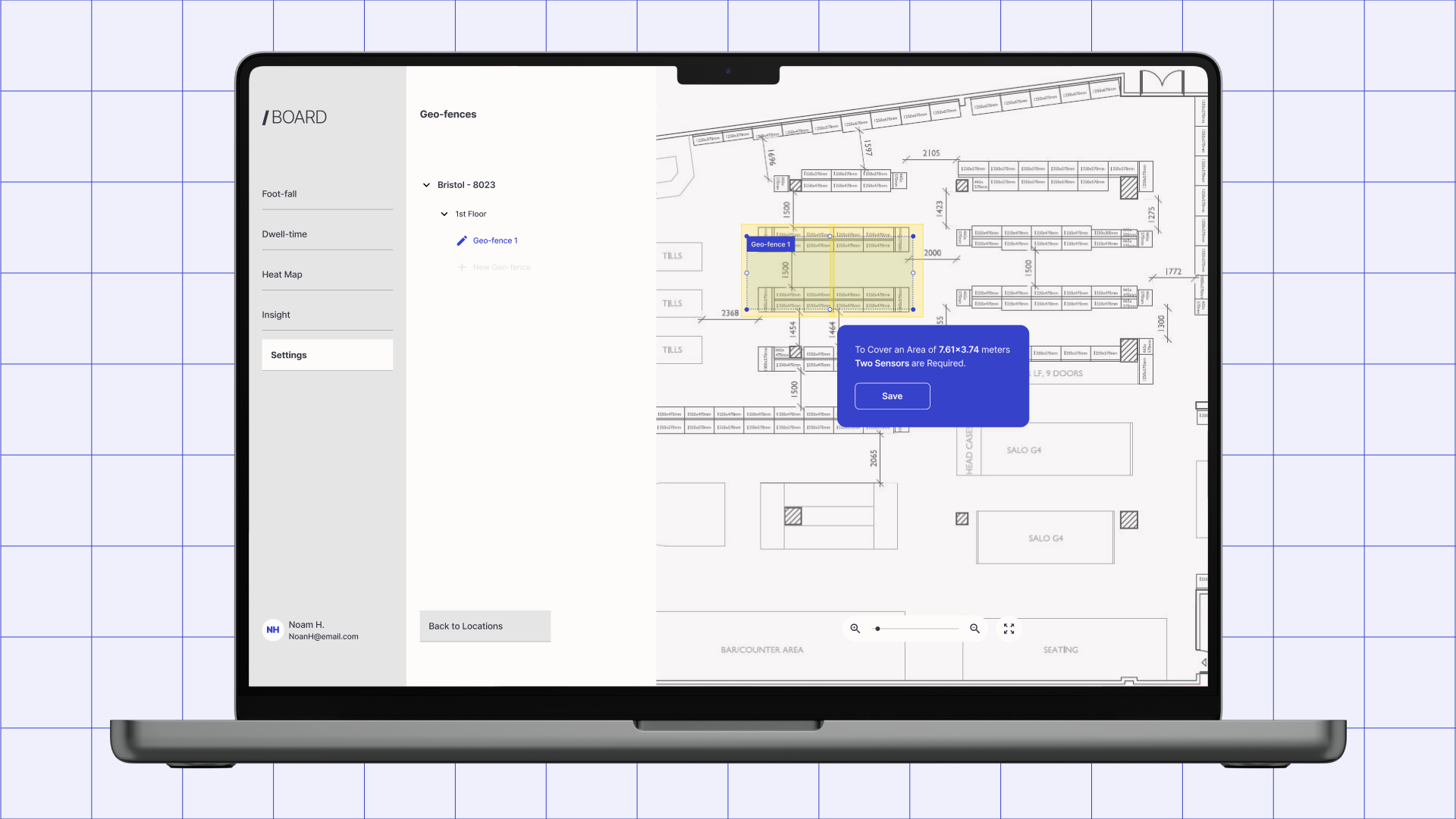
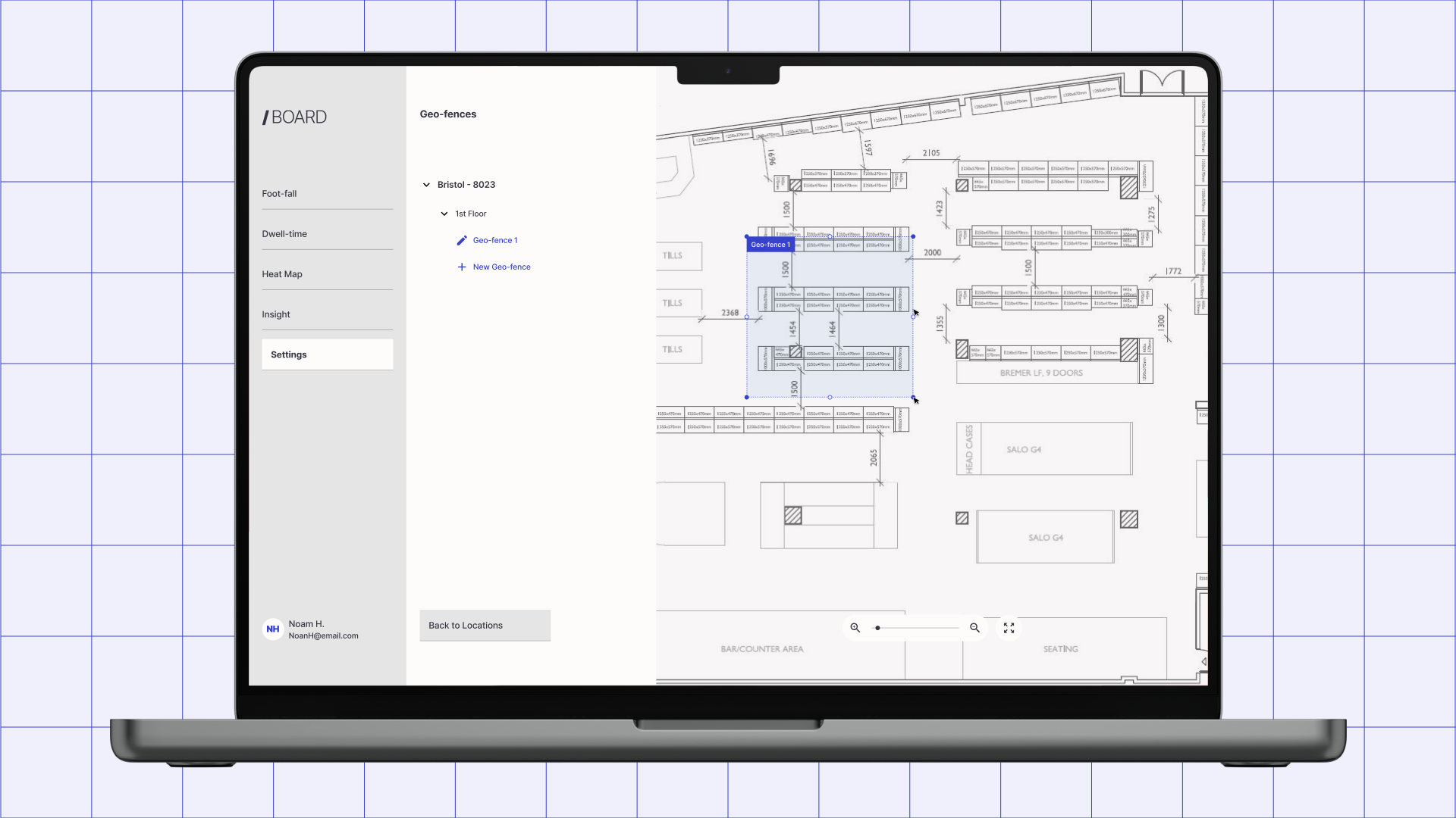
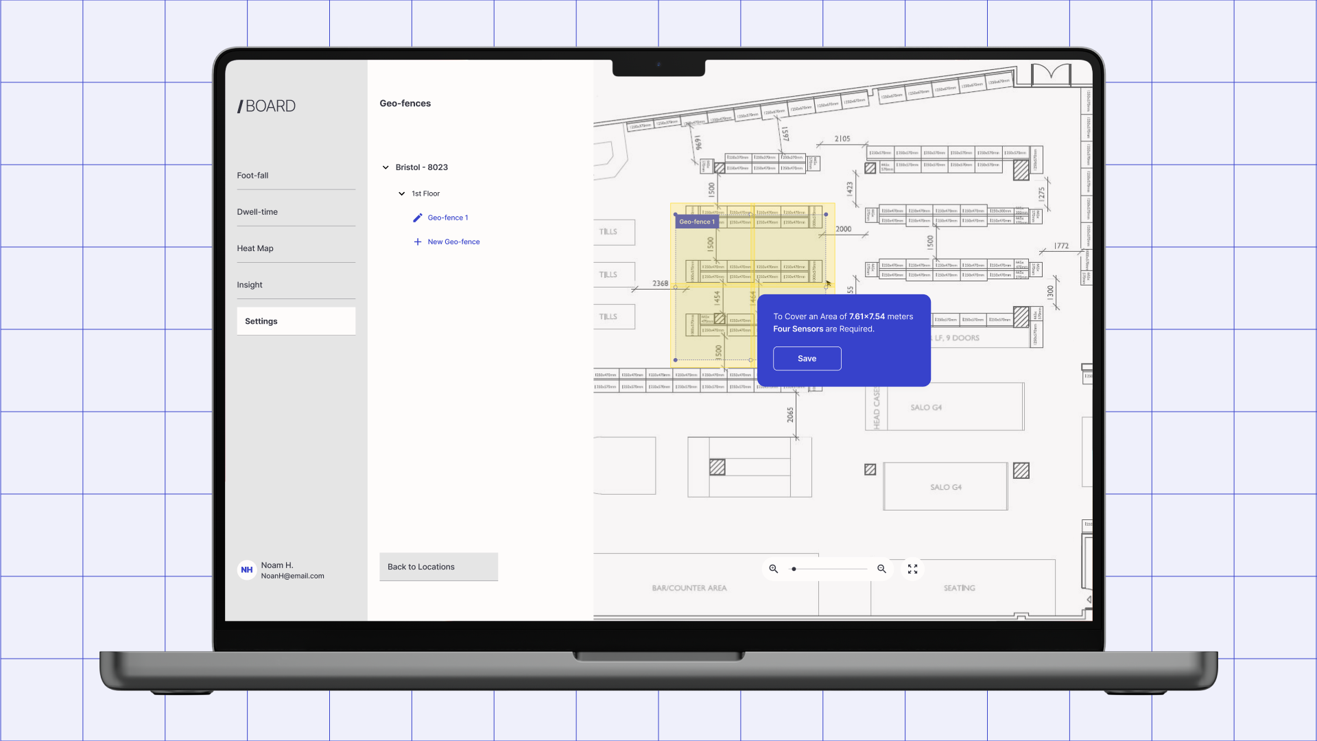
-
UX Designer
-
Product Manager, Frontend Engineering, Algorithms Engineering, Sales, Customer Success
-
12 weeks
-
Web dashboard
Project Intro
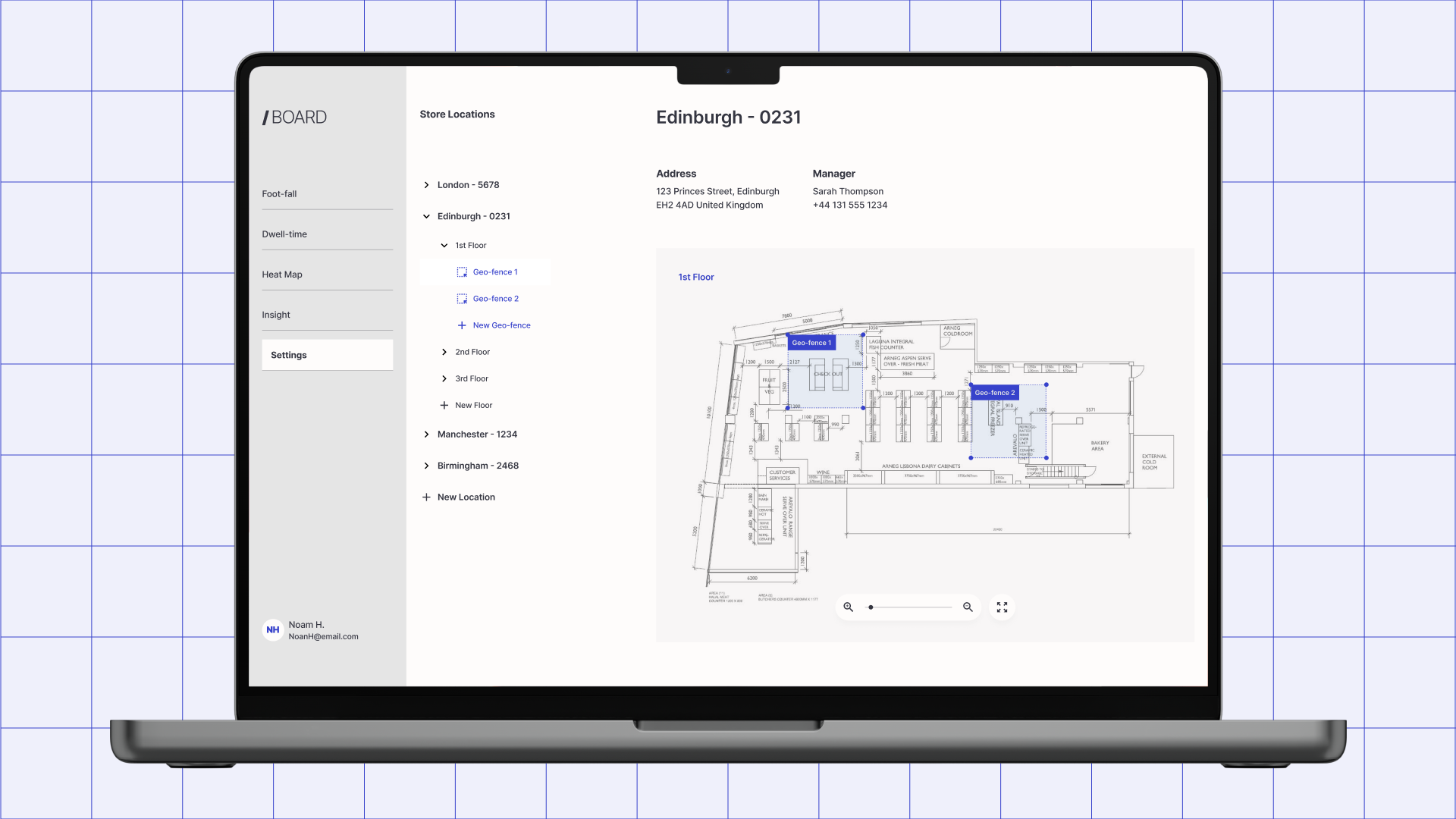
This retail sensor platform is a deployment tool used by IT managers, brand leads, and small business owners to plan in-store sensor coverage. Every deployment ran through engineering, floor plan review, sensor placement, coverage validation, which capped how fast the business could grow. I redesigned the deployment process as a self-service dashboard, moving engineering from a prerequisite to a downstream check.
My Role
I led design end-to-end: discovery, strategy, interaction design, and validation. I worked alongside a product manager, frontend and algorithms engineers, and partners in sales and customer success, and owned the call that mattered most: repositioning the product from a configuration tool into a decision-making platform. Everything below followed from that.
"Every time we wanted to open a new location, we'd have to wait. Wait for someone from engineering to look at the floor plan, wait for them to tell us where the sensors should go, wait for them to confirm it would actually work. I run a retail team. I'm not trying to learn sensor physics, I just need to know if a location is going to work before I commit to it. But there was no way to find that out myself. Every answer had to come from someone else's calendar."
Key Design Decisions
Decision 1:
An open sandbox instead of a guided wizard
The first prototype walked stakeholders through deployment step-by-step. It tested badly — not because the steps were wrong, but because the format was. Planning isn't linear. Stakeholders wanted to try a layout, second-guess it, and compare it against another, and a wizard punishes exactly that instinct.
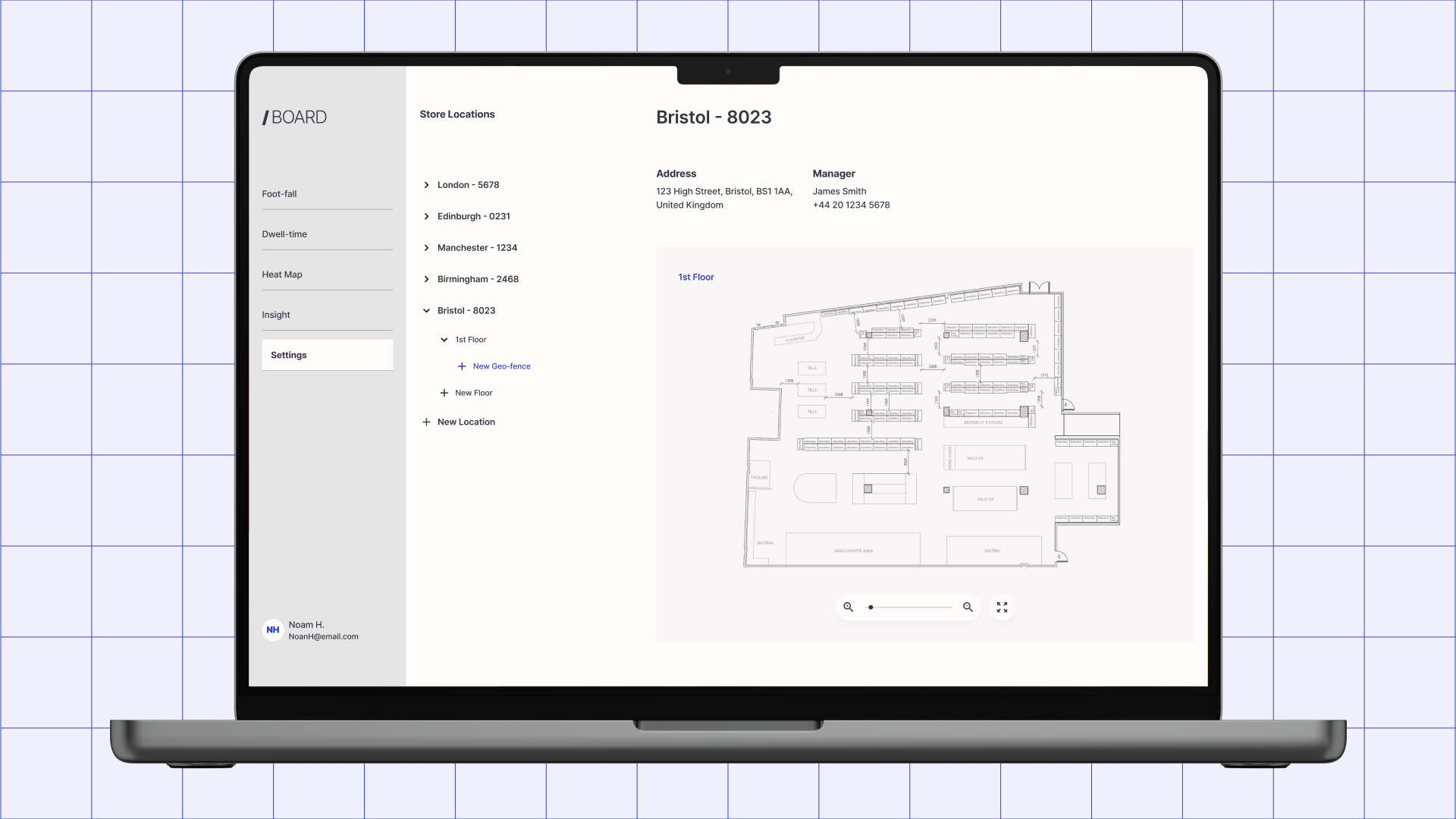
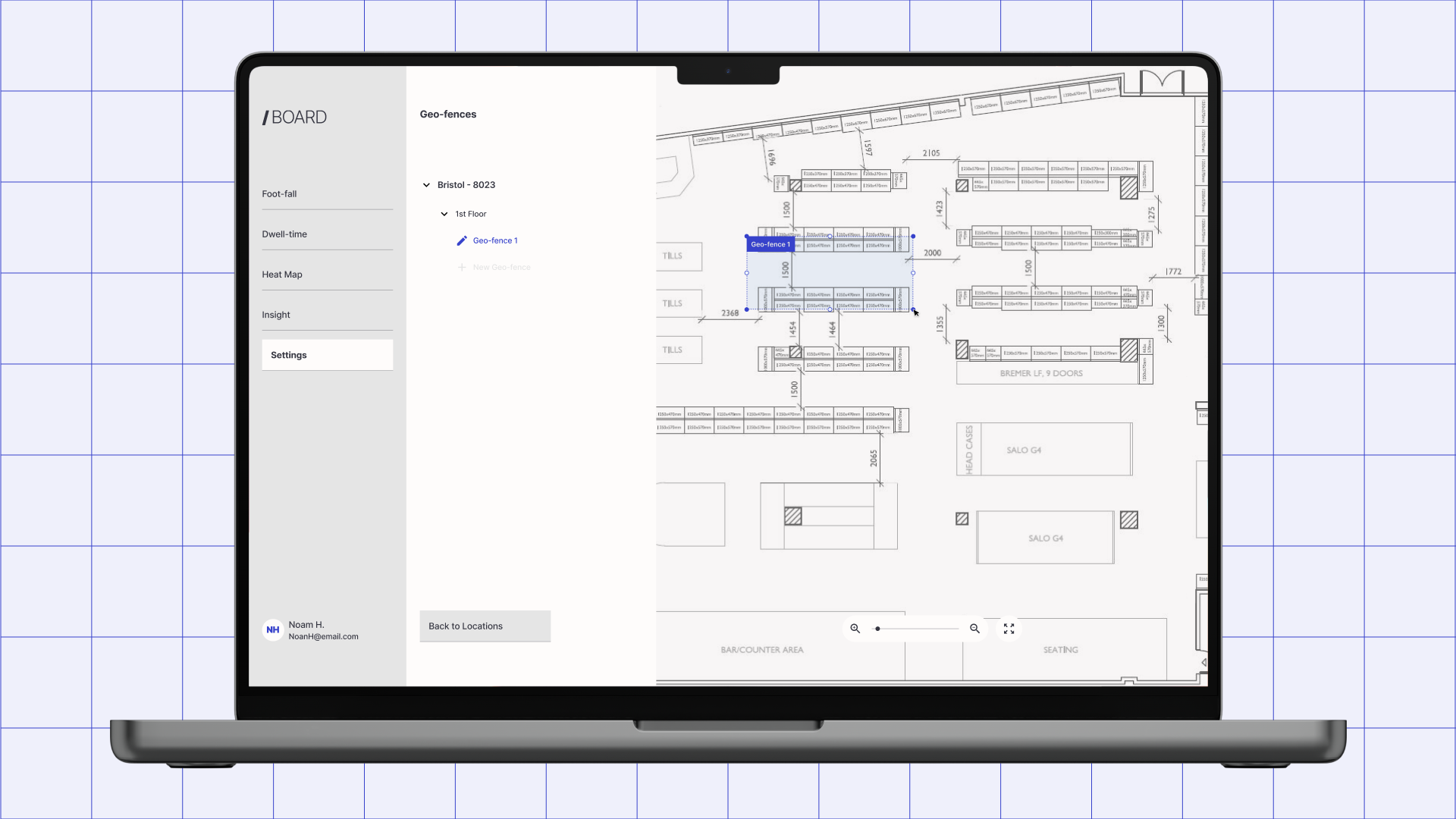
I rebuilt the experience as an open sandbox: no gates, no forced sequence, contextual nudges instead of mandatory steps. Independent planning completion rose 25% over the wizard baseline — and just as tellingly, the stakeholders who'd struggled most with the guided flow adapted to the sandbox almost immediately. That reversal is what told me the format, not the content, had been the problem.
This decision set the direction for everything else in the project: once planning was reframed as exploration instead of procedure, the rest of the interface had to follow suit.
Decision 2:
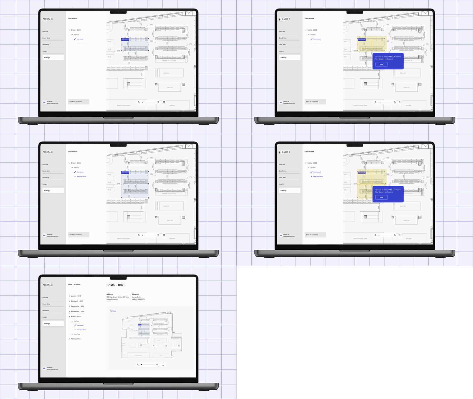
Cost and coverage feedback, live on canvas
Cost-versus-coverage modeling had always lived with engineering. I moved it onto the canvas, updating in real time as sensors were placed, so the sandbox's exploratory premise held up under an actual planning decision — not just a layout exercise. Working with the algorithms team, I scoped the output to directional accuracy: precise enough to act on, simple enough to need no translation. It became the single biggest reason stakeholders stopped looping engineering back in mid-planning.
Decision 3:
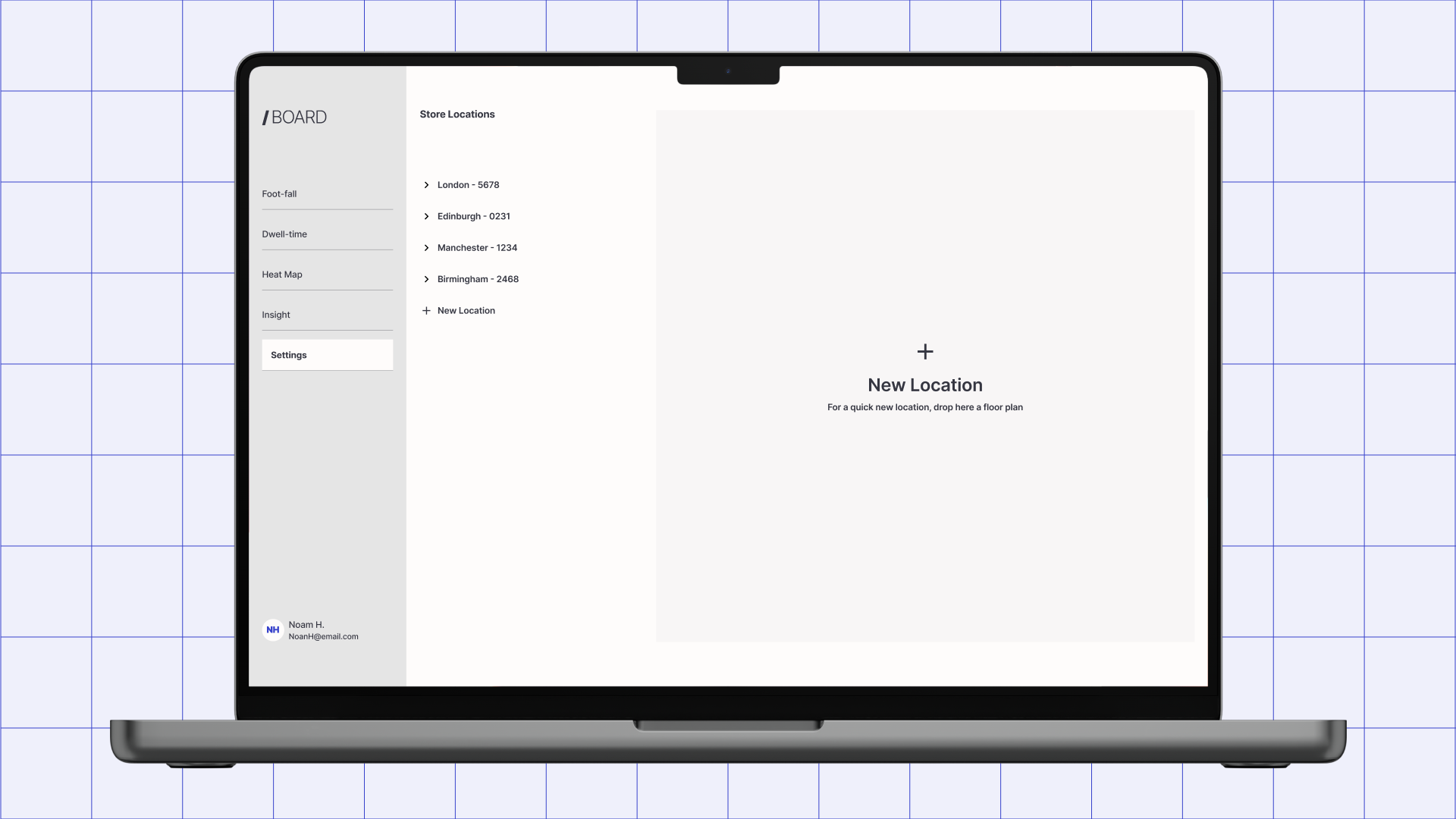
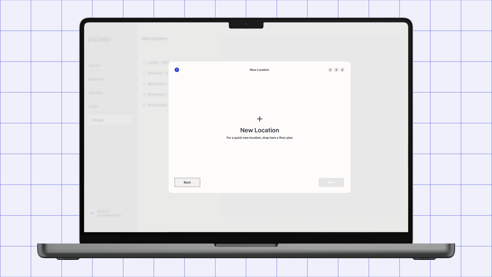
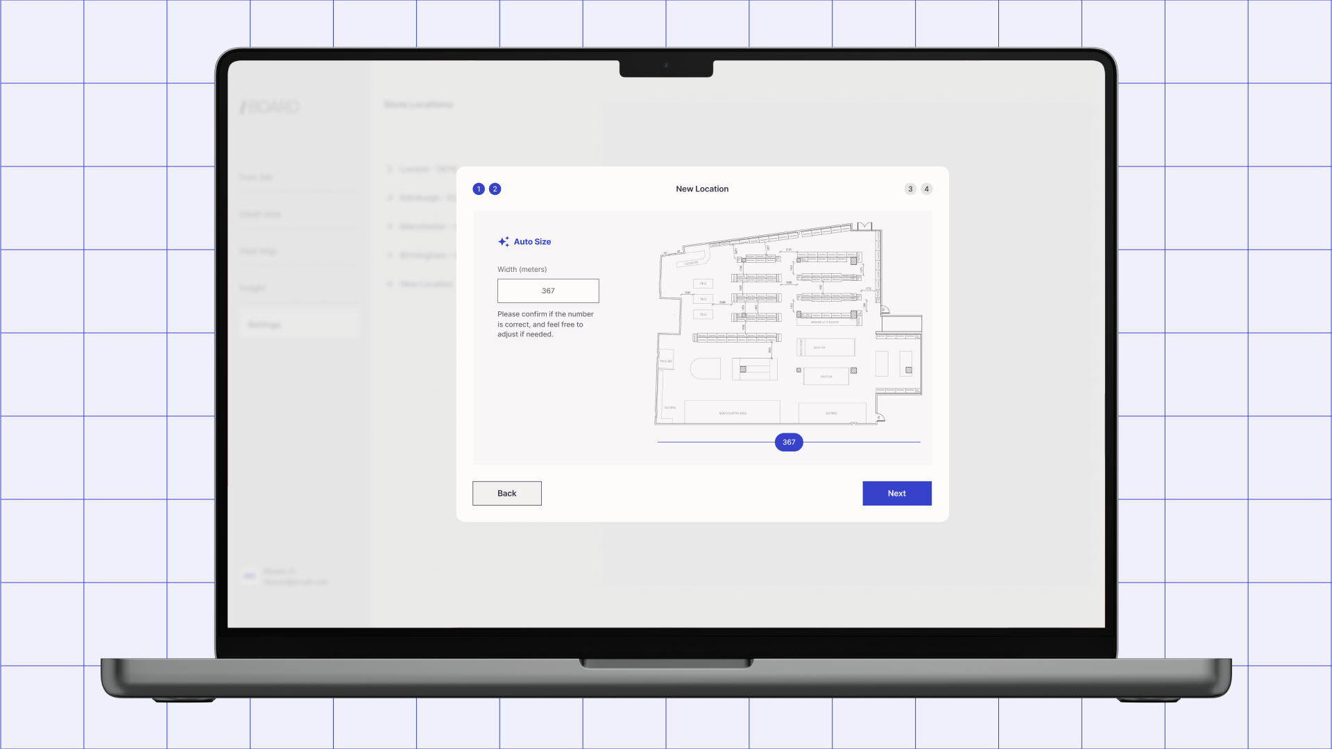
An upload flow built for the floor plans people actually had
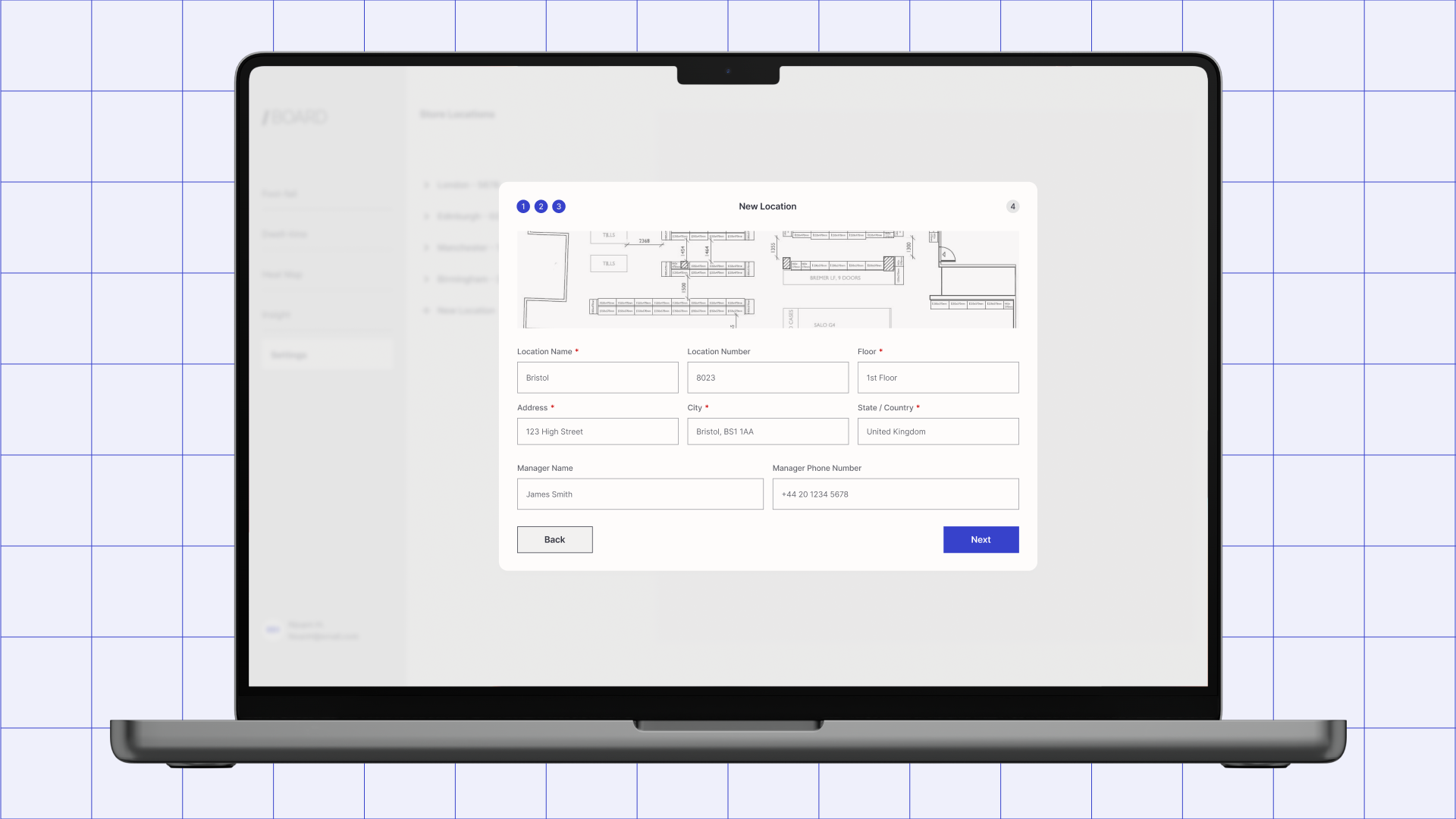
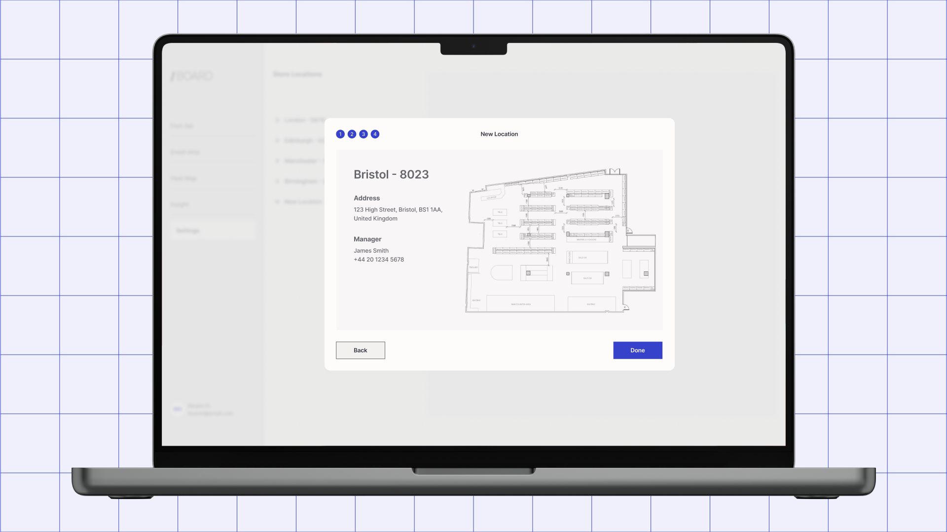
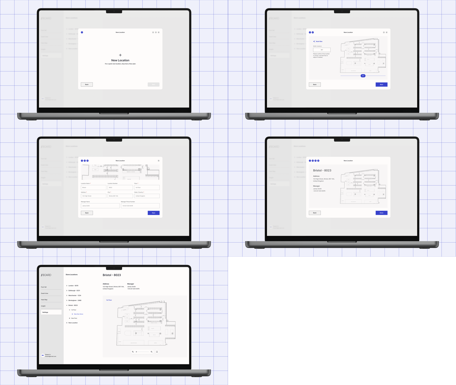
Stakeholders showed up with PDFs, phone photos of sketches, and the occasional CAD file — never anything standardized. The sandbox only works if people can get their real floor plan into it on the first try, so I designed an upload-and-calibrate flow that took whatever format arrived and scaled it to planning fidelity in-browser. This closed the engineering preprocessing step that used to gate every submission before the sandbox ever opened.
Outcome
Deployment timelines fell 33%, from six months to four. Independent stakeholder planning rose 25% against the prior wizard-based flow. Engineering's role in planning — once required at every stage — became a downstream check rather than a starting gate. The shift was structural, not cosmetic: the business moved from delivering a service to running a platform, and that kind of change keeps paying out long after launch.